Color is far more than decoration; it’s emotion, personality, and energy combined. The moment you step into your Manhattan home, the tones surrounding you shape how you feel, how you think, and even how you connect with the space.
Choosing the right paint colors is both an art and a science. It’s a convergence of psychology and aesthetics that transforms walls into expressions of warmth, vitality, and serenity. Whether your home overlooks the park or the skyline, color has the power to enhance your surroundings and reflect your unique sense of style.
Selecting paint tones for your home should feel exciting, not overwhelming. Every hue tells a story, and your residence is the perfect place for that story to unfold. From airy neutrals that bring light and calm to bold, sophisticated shades that add drama and elegance, the science of color offers endless ways to elevate your environment. Once you understand how color behaves and interacts with light, you can curate a palette that feels both balanced and beautiful — a space that feels distinctly your own.
Understanding How Color Shapes Your Space
When chosen with intention, color can create a sense of expansion, connection, and balance throughout every room. The science behind this lies in how color affects perception and mood. Warm tones, such as amber, terracotta, and honey beige, bring vibrancy and energy, ideal for gathering areas where you want to feel inspired and uplifted. Cooler tones like pale blue, silvery sage, or soft gray-green introduce tranquility and ease, perfect for rooms meant for relaxation and reflection.
Each hue has its own rhythm. Richer shades ground a space and create intimacy, while lighter ones open it up and invite the light to dance across the walls. If you want your home to feel timeless and effortlessly elegant, consider a palette built around neutrals with subtle undertones like creamy whites, warm taupes, or pale sands. They act as a harmonious canvas that complements textures, finishes, and art without overwhelming the senses. In Manhattan homes, where visual balance matters as much as style, these choices create a sense of calm amid the borough’s vibrant energy.
Each hue has its own rhythm. Richer shades ground a space and create intimacy, while lighter ones open it up and invite the light to dance across the walls. If you want your home to feel timeless and effortlessly elegant, consider a palette built around neutrals with subtle undertones like creamy whites, warm taupes, or pale sands. They act as a harmonious canvas that complements textures, finishes, and art without overwhelming the senses. In Manhattan homes, where visual balance matters as much as style, these choices create a sense of calm amid the borough’s vibrant energy.
The Influence of Light on Color Perception
Light and color share a delicate relationship. The way a hue appears changes depending on how much light it receives and where that light comes from. Natural daylight enhances the true character of color, while artificial lighting can dramatically shift its tone. Understanding this interplay is essential to choosing paint that looks stunning in every condition.
Sunlight streaming through the windows brings warmth to creamy neutrals and golden undertones. Cooler daylight, on the other hand, emphasizes crisp whites and pale grays, giving shades a sleek, modern edge.
Observe how each color sample behaves throughout the day; a shade that glows beautifully in the morning might deepen to a richer tone at dusk. This dynamic quality adds depth and movement to your walls, giving your home a living, breathing energy.
Artificial lighting also deserves thoughtful consideration. Soft, warm bulbs can bring out the richness of earthy tones, while cool lighting enhances clarity and freshness. Picture the atmosphere you want to create: cozy and welcoming or bright and invigorating. Once you understand the light, you’ll see that choosing color isn’t just about aesthetics; it’s about creating emotion through illumination.
Achieving Color Harmony Throughout Your Home
Harmony is the thread that connects one space to the next, creating a sense of flow and sophistication. In a Manhattan home, where rooms often transition seamlessly, this continuity is essential. A cohesive palette ensures that every area feels connected while still allowing for subtle personality shifts from one room to another.
Start by selecting a foundational hue — a versatile color that serves as the anchor for your palette. From there, explore lighter or deeper variations of that same tone for adjacent rooms. For example, a warm stone gray in the living room can transition to a soft mushroom beige in the dining area and then evolve into a creamy white in the kitchen. This creates an elegant gradient effect that feels natural and intentional.
Trim, doors, and ceilings also play an important role in maintaining cohesion. Using a consistent shade of white or neutral on these elements ties the design together and creates visual rhythm. When every tone flows gracefully into the next, your home feels polished, spacious, and beautifully curated.
Highlighting Architectural Beauty Through Color
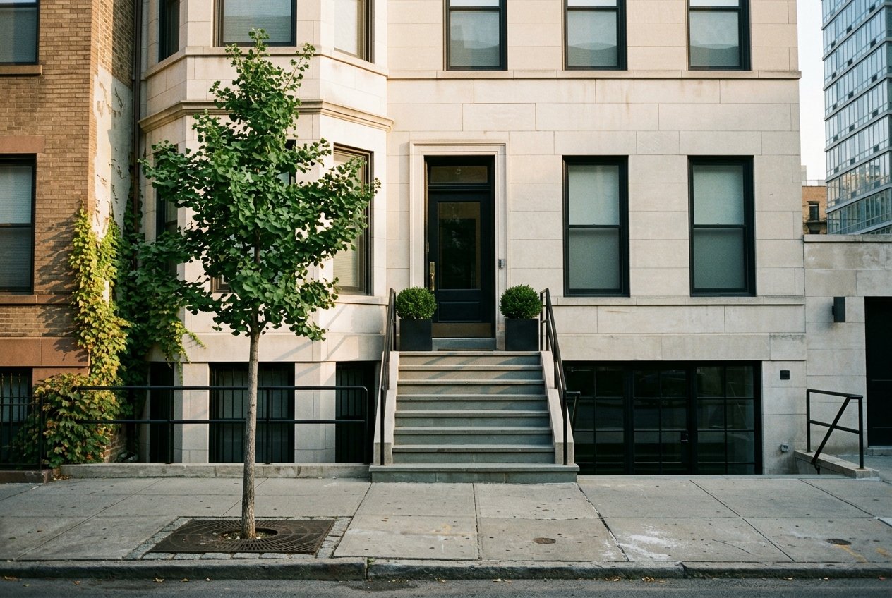
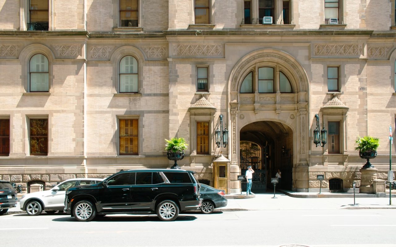
Manhattan’s real estate landscape features a range of distinctive architectural details, from graceful moldings and soaring ceilings to sleek, contemporary lines. The right paint tones can celebrate these elements, turning each feature into a statement piece.
For homes rich in character, warm neutrals, soft blushes, or muted jewel tones emphasize texture and depth. A deep navy accent wall can draw attention to a fireplace or custom shelving, while soft ivory enhances ornate trim and brings out natural light. In more streamlined spaces, shades of pearl gray, alabaster, or pale stone emphasize clean geometry and create an atmosphere of refinement.
Architectural contrast is also an elegant design tool. Pairing darker walls with lighter trim sharpens edges and adds definition. Conversely, painting the walls and trim in the same hue — just in different finishes — creates a sophisticated, monochromatic effect. With each color choice, you are shaping how light moves, how texture reads, and how architecture feels alive within your home.
Creating Emotional Resonance
Color affects emotion in ways that feel almost instinctive. Each hue carries a psychological signature that influences how you experience a space. When you align your color palette with the emotions you want to feel, you create rooms that enhance your well-being and sense of purpose.
Soft, natural shades like sand, misty green, and pale rose evoke comfort and composure, perfect for living areas or retreats where you unwind. Vibrant tones like coral, teal, or mustard can energize and inspire creativity in spaces designed for art, work, or social gatherings. Deep colors, such as espresso, indigo, or forest green, lend a sense of confidence and grounding, adding sophistication to formal rooms.
The secret lies in balance. Introduce depth through accent walls, artwork, or textured finishes while maintaining an overall palette that feels harmonious. When your surroundings reflect the energy you wish to cultivate, your home becomes a mirror of your mood and intention — a true expression of who you are.
Selecting Paint With Precision
Choosing the right paint tone is an opportunity to design intentionally. Start by considering the function and atmosphere of each space. Do you want your kitchen to feel luminous and fresh? Would you like your bedroom to feel serene? Once you define these emotional goals, selecting the right hue becomes intuitive.
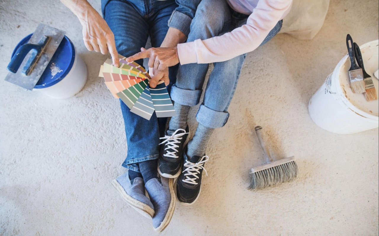
Testing is essential. Apply sample swatches directly to your walls and observe how they shift throughout the day. Pay attention to how color interacts with your furnishings, flooring, and artwork, as a hue that complements one texture might transform next to another.
Sheen also affects perception: matte finishes soften the look and absorb light, while satin or semi-gloss finishes reflect it, creating a sense of vibrancy.
The Power of Color in Your Manhattan Home
Color is one of the most powerful tools you have to shape your environment. It enhances architecture, transforms light, and influences emotion in subtle yet profound ways. By understanding the science of color and applying it with creativity, you can craft a home that radiates harmony, energy, and sophistication.
If you’re ready to find the space of your dreams, explore the real estate market in Manhattan with Mathiew Wilson of Alignment NY today.
If you’re ready to find the space of your dreams, explore the real estate market in Manhattan with Mathiew Wilson of Alignment NY today.